Effective project management requires planning and monitoring, and without proper tools, teams face missed deadlines and poor communication. Project charts are vital as they provide visual roadmaps, breaking down tasks, highlighting dependencies, and tracking performance. Different charts serve specific purposes; for instance, Gantt charts are ideal for timelines, while Kanban boards suit Agile teams, and risk matrices focus on risk management. For project managers, these charts enhance decision-making, reduce confusion, and ensure team alignment, making the choice of the right chart crucial for success.
What Are Project Management Charts and Diagrams?
Project management charts and diagrams help teams organize, monitor, and execute projects by visually representing tasks, timelines, and workflows. They simplify complex data, making it easier to track progress and identify issues. For instance, Gantt charts illustrate task durations and overlaps, while Kanban boards show work stages. Different diagrams serve various purposes, such as scheduling with timelines and PERT charts, or mapping processes with flowcharts. Risk matrices detail project risks, and tables organize data for clarity. These tools improve communication among teams and stakeholders, allowing for quick updates and adjustments. Overall, project management visuals enhance organization, efficiency, and stress reduction in project control.
Benefits of Using Project Charts in Project Management
Project charts offer significant advantages that improve how teams plan and execute work. These visual tools transform complex project details into clear formats, making management more efficient. Whether using a plan chart for scheduling or a project diagram for workflows, these visuals help teams stay organized and productive.
Clear Visualization of Project Scope
A well-designed project management chart provides an instant understanding of the entire project. It shows all tasks, deadlines, and dependencies in one place, preventing confusion about responsibilities and timelines. For example, a project management diagram like a Gantt chart displays task durations and overlaps, helping teams see how delays in one area affect others. With a single glance, everyone knows what needs to be done and when.
Better Team Collaboration
When teams use project charts, communication improves significantly. Instead of long email chains or meetings, members can refer to the latest visual updates. A project management table may summarize key data, while a Kanban board shows real-time task progress. This transparency reduces misunderstandings and keeps everyone aligned. Remote teams benefit from these charts as they are a central reference point for all project updates.
Improved Risk and Resource Management
Project charts help identify potential problems before they escalate. Like a risk matrix, a project diagram highlights high-priority threats, allowing teams to take preventive action. Resource allocation also becomes easier when using a plan chart that tracks workloads. Managers can see which team members are overburdened and redistribute tasks accordingly. This proactive approach minimizes delays and ensures smoother project execution.
Teams gain better project control by integrating project management charts into daily workflows. These visuals simplify planning, enhance teamwork, and reduce risks—leading to more successful outcomes. The right chart makes complex projects manageable and keeps everyone on the same page.
12 Essential Project Charts and Diagrams for Effective Project Management
Project management requires clear visualization tools to plan, track, and execute work efficiently. The right project charts and diagrams help teams understand complex information, identify dependencies, and maintain progress. Below is an in-depth look at twelve essential project management charts, their uses, benefits, and real-world applications.
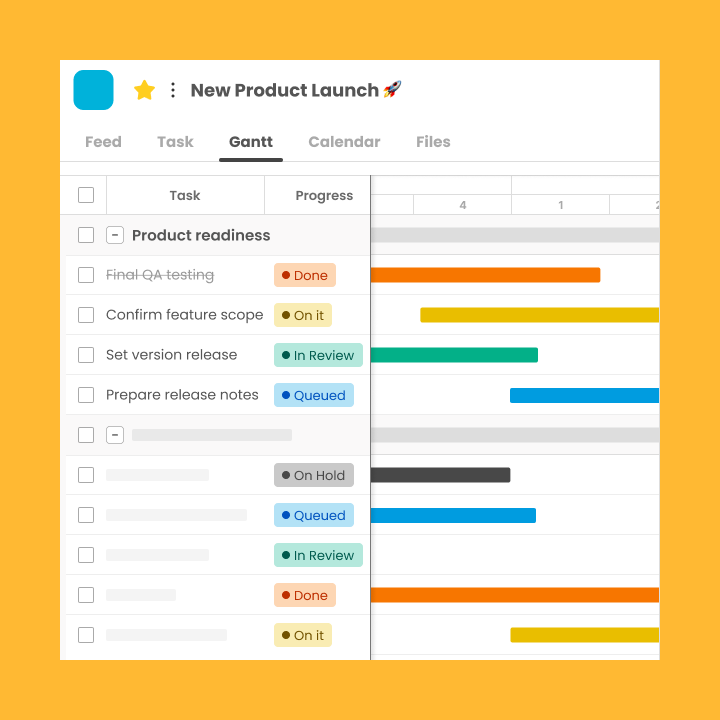
1. Gantt Chart
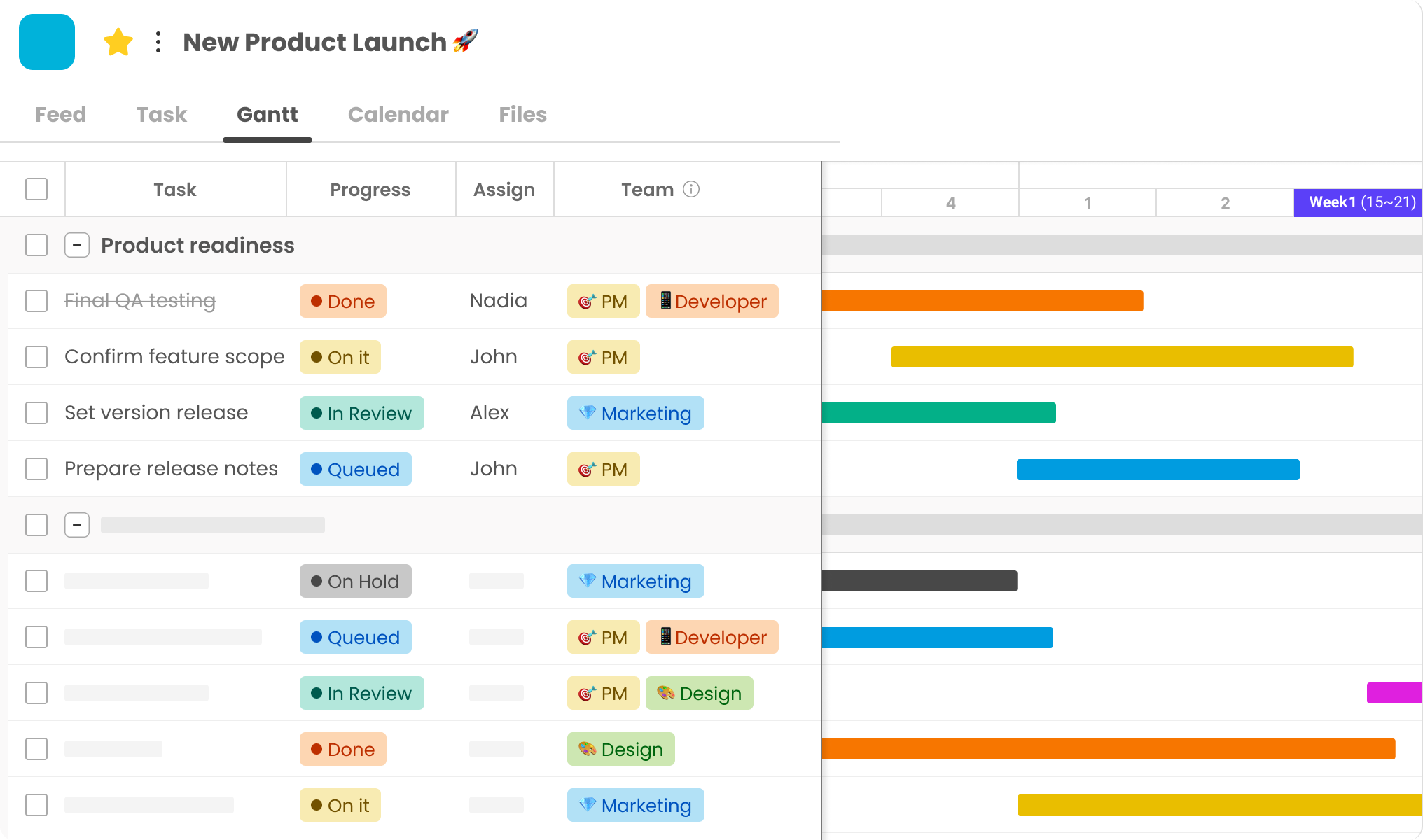
The Gantt chart is one of the most famous project management diagrams. Tasks appear as horizontal bars along the timeline; it shows the start date, duration, and end date. The visual layout helps keep track of progress in a single glance while observing overlaps. Gantt charts are handy because they show dependencies among tasks. When team members see the arrows, they know how a delay in one area can throw another off track.
These diagrams often contain milestones and percent complete specs showing the project’s status. Many industries use Gantt charts, from construction to software development, because they communicate complex schedules. For example, a team planning an event may use a Gantt chart to manage venue booking, coordinating with vendors, and marketing activities for the main event to ensure everything comes together.
2. Work Breakdown Structure (WBS) Diagram
A Work Breakdown Structure (WBS) is a project diagram that breaks down a project into smaller, more manageable pieces. Starting with larger deliverables at the top level, the WBS segregates the same into smaller deliverables, tasks, subtasks, and so on. This method enables Teams to understand the complete project and clarify accountability. In complex projects, the work breakdown structure is beneficial as several teams need to know how their work fits into it.
Engineering companies, for example, create a WBS to break the project of building a bridge into design, material procurement, foundation, and superstructure components. It enables teams to manage resources adequately, thereby estimating loopholes in the project plan before the commencement of the work.
3. PERT Chart (Program Evaluation Review Technique)
The PERT chart differs from the Gantt chart because it presents the relationship between tasks, not their timing. This project management diagram uses circles and arrows to represent all the project tasks and their relationships to each other. One of its most powerful features is identifying the project’s critical path, the sequence of tasks that determines the minimum project duration. PERT (Program Evaluation Review Technique) charts are best for projects with uncertain times.
Indeed, PERT uses probabilistic duration forecasts. Research institutions and product development teams rely on PERT charts for many innovation projects that initially feature substantial unknowns. For instance, a pharmaceutical company may use the PERT chart to show how the clinical trial phases depend on lab results and regulatory approval. It aids with seeing obstacles in the development process.
4. Flowchart
We provide free flowchart symbols and their meanings in the following table. These diagrams are great for breaking down complicated processes into different steps. Thanks to which any process can be improved. The symbols will have the same meaning, enabling team members to read diagrams quickly. So, all process steps are represented by rectangles, decisions by diamonds, and start/end by ovals. Manufacturing plants may use flow charts to show step-by-step assembly line processes.
IT departments often use flowcharting to create troubleshooting guides. A customer service department could use a flowchart to map the process of handling their complaints and show when complaints get escalated to the other tiers of support. The pattern created by putting bubbles or arrows on a sheet helps understand the different actions easily.
5. Kanban Board
More and more teams around the world are discovering the Kanban board. Agile teams love its simplicity, efficiency, and easy workflow visualization. A project management tool generally contains columns representing tasks at different stages of work, such as “To Do,”; “In Progress,” and “Done.” As tasks get worked on, they move through the different columns. Thus, all tasks present real-time visibility of their status. Kanban is about limiting work in progress. In turn, this stops teams from getting overloaded or causing bottlenecks.
Organizations offering online promotional services frequently utilize the Kanban board to document the campaign’s idea, creation, and publication. The board’s visual nature allows each team member to see what others are working on, thus eliminating the need for status meetings. Many teams add columns for quality assurance or client approval to their Kanban boards to enhance workflow configurations.
6. Critical Path Method (CPM) Diagram
The CPM (Critical path method) helps project management optimize their schedules. The sequence of dependent tasks in a project that will take the longest to finish is called the critical path, which establishes the shortest project time. If the manager keeps the attention focused on the task, they can allocate the resources to work on preventing a delay. CPM diagrams show a project’s schedule that requires a lot of resources and time (needs more accuracy, especially for construction projects).
Construction project managers regularly utilize CPM to coordinate the many trades involved in building projects. For instance, if electrical work falls behind, it will hold up the drywall and, thus, the painting. The depiction of task dependencies provides clarity to all stakeholders for the immediate work and where delays can cause a ripple effect affecting all other tasks.
7. RACI Matrix
The RACI matrix clarifies project roles and responsibilities, one of the leading causes of confusion. The ‘RACI’ or project management chart defines who is responsible, accountable, Consultable, and informed for each task or deliverable. By clearly identifying these roles, the matrix avoids the usual problems of double-ups and tasks slipping through the cracks. In cross-functional projects, where multiple departments or teams need to work together, the RACI framework is sound.
A company that is deploying a new enterprise software system will likely have in place a RACI matrix that clarifies IT staff are Responsible for technical implementation, department heads are Accountable for taking it up in their areas, subject-matter experts are to be Consulted on configuration decisions, and all staff is Informed about training schedules. The clear demarcation of responsibilities fosters better communication and decision-making throughout the project.
8. Risk Matrix
A project risk matrix provides a structured framework for project teams to identify and prioritize risks. This project diagram maps the likelihood of project risks versus the intensity of impact on the project. The picture right away shows us which risks to watch out for closely and which ones are low concern. Risks that are high probability and impact appear in the upper right quadrant, indicating the need for mitigation plans.
Financial institutions may utilize risk matrices to evaluate regulatory, Market, and operational risks when introducing new products. The format can give teams direct access to their risk profiles and demonstrates how resources are allocated for risk reduction. By constantly updating the risk matrix throughout the project’s lifecycle, the team can see how the risk landscape changes with the project and gain further insights.
9. Milestone Chart
Milestone charts provide a snapshot of the project activity rather than the tasks. These project management diagrams highlight important events along a timeline, giving stakeholders a quick understanding of whether the project is on schedule. Milestone charts are simple. They are perfect for executive presentations and client updates when task details are too much.
A software development company can show milestone charts to investors with a Prototype Completed, Beta testing initiated, and Market launched. Unlike complicated charts, milestone charts boil down the progress of a project to its most essential elements. Thus, they are effective communication tools for an audience who need this information without technical details. Organizations frequently utilize milestone charts and more detailed planning instruments to offer varying project visibility to diverse stakeholders or interested parties.
10. Pareto Chart
A Pareto chart is a special chart that shows the 80/20 principle. It is an important project management tool. This custom project diagram uses bars to show frequency or cost and adds a line to show percentage. The visual format makes it easy to see which few factors produce the most problems or expenses. Quality control teams often employ Pareto diagrams to pinpoint the defects that appear most often in production processes.
For example, a car manufacturer may find that 80% of assembly line defects come from three mistakes. This insight allows teams to focus on where to improve to have the most significant impact. Using the Pareto chart, project managers could also apply the same principle to analyze the budget overrun, schedule delay, or resource constraint.
11. Burn-down and Burn-up Charts
Teams completing Agile projects use burn-down and burn-up charts to track progress. The burn-down chart assesses the remaining work as the sprint progresses to a deadline. It gives a snapshot of whether the team will finish the planned work by the deadline. On the other hand, the burn-up chart tracks the total work completion versus time. This makes it easier to identify changes in scope. Daily visibility is given to the sprint progress through these project management charts, allowing the team to adjust their pace or scope.
These teams regularly use these charts in their daily stand-up meetings to determine if anything needs to change to hit the sprint’s goals. The visual nature of these charts helps teams quickly identify trends. For example, if a burn-down line isn’t dropping fast enough, it might signal trouble. Meanwhile, an unexpected jump in a burn-up chart can indicate scope creep. They encourage accountability and swift adjustments by making the advance (or lack thereof) visible at once
12. Pie Chart
Pie charts are used in project diagrams that show proportional distributions. The circular graphs divide a whole into slices, representing the percentage or proportion of the various components. Project managers frequently use pie charts to show how much of a budget will be supplied, how much of a resource will be used, or how long each project phase will take. Pie charts are easy to read, so people can tell which elements take up the most significant share.
A project manager may use a pie chart to illustrate how a project budget breaks down into labor, materials, equipment, and overhead costs. Nonetheless, pie-chart use works best when its segments are kept to a minimal number. When there are too many little pieces, the visual appeal diminishes. Project managers will often collate all the smaller items into an “other” category to make the chart easy to read while still keeping the information readable.
How to Choose the Right Project Chart
Selecting the best project chart for a task requires understanding the project’s needs and team dynamics. The exemplary project management diagram can simplify workflows, while the wrong one may create confusion. Key factors like project complexity and team structure help determine which visual tool works best.
Based on Project Complexity
Simple projects with few tasks may only need a basic plan chart like a timeline or milestone tracker. These provide clear deadlines without unnecessary detail. A project management table or Kanban board helps organize multiple moving parts for moderately complex work. Highly complex projects often require detailed project charts like Gantt or PERT diagrams. These show task dependencies and critical paths that keep large-scale work on track.
Based on Team Size and Workflow
Small teams often benefit from straightforward project diagrams like flowcharts or Kanban boards. These require little explanation and adapt quickly to changes. Larger teams may need more structured project management charts like RACI matrices or WBS diagrams. These clarify responsibilities across many members.
Agile teams typically use burn-down charts or Kanban boards to support iterative work. Traditional teams prefer Gantt charts for fixed schedules. Matching the project management diagram to how the team works ensures better adoption and results.
The best approach often combines multiple project charts to address different needs. Start with the project’s core requirements, then select visuals that make those elements clear to everyone involved.
Best Practices for Using Project Management Charts
Project charts help teams stay organized, but using them effectively requires following key guidelines. Proper implementation of project management diagrams ensures clear communication and better results. These practices help teams get the most value from their visual tools.
Keep Charts Simple and Clear
The best project charts communicate information quickly. Avoid overcrowding diagrams with too much detail. Focus on showing only the most important tasks and relationships. Use consistent colors and labels so team members can understand the project diagram at a glance. Update charts regularly to reflect current progress without confusing them.
Match Charts to Audience Needs
Different stakeholders need different information from project management charts. Team members may require detailed task lists, while executives prefer high-level milestone views. Customize the project management diagram based on who will use it. For daily standups, a simple Kanban board works well. For client reports, a polished Gantt chart might be better.
Combine Charts for Full Visibility
No single plan chart shows everything about a project. Use multiple project management tables and diagrams together for complete tracking. A WBS can outline the big picture, while a Gantt chart tracks timelines. Pair a risk matrix with a burn-down chart to monitor threats and progress. This layered approach gives teams all the information they need.
Train Teams on Chart Usage
Even the best project diagram fails if people don’t understand it. Take time to explain how to read and update each project management chart. Show team members where to find key information and how to report progress. Regular refreshers help new members get up to speed quickly. Proper training ensures everyone uses the tools correctly.
Following these practices helps teams get maximum value from their project charts. Well-designed and properly used diagrams keep projects organized and on track. The right approach turns simple visuals into powerful management tools.
Conclusion: Visualize Success with Project Management Charts
Well-crafted project charts can go a long way toward making project management effective. These tools align teams to the same visual language of project management by making complex plans comprehensible and straightforward, identifies risks, tracking progress, and informing the whole team on the next steps. A simple plan chart is a very basic plan that can form the backbone of any preliminary project scenario.
Choose the charts that suit your project; this is the key. A Gantt Chart makes timelines visible, and a Kanban Board clearly optimizes workflows. Risk matrices help visualize and identify potential problems before they happen. WBS diagrams break down complex tasks into simple bite-size tasks. By correctly using these project management charts, teams gain better control over deadlines, resources, and communication. An active chart user is a successful team. The visuals are updated regularly, and the team is trained for the same.
Using several project diagrams gives the complete picture of milestones and deliverables.
Overall, project charts are big rainmakers, not just visuals but also efficiency tools. When teams use and maintain the appropriate format, they can plan better, collaborate, and achieve better results. Representations or visualizations help decision-makers organize their thoughts and develop models to solve problems.